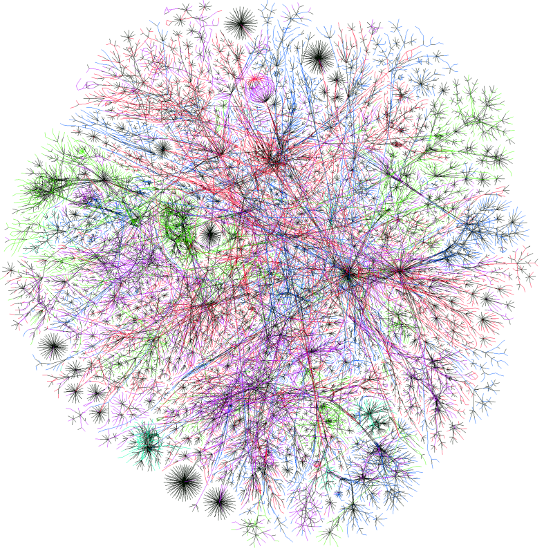
Image – Map of the Internet (2003)
Map of the Internet (2003) Page 1056
Chapter 30
Map of the Internet (2003)
This map of the Internet, created by Barrett Lyon in 2003, is a schematic representation that shows the connections between network routers. More specifically, it measures the number of connections between each router. The locations of routers are color-coded: routers in Asia/Pacific are colored shown in red, those in Europe/Middle East/Africa are shown in green. North American routers are in blue; routers in Latin America and the Caribbean are in yellow.

Questions for Analysis
1. What impression does this map of the Internet make on you? If this map looks like nerve pathways, what does this say about the Internet?
2. Which regions appear to have the densest connections and the most connections? What would a map of the Internet look like in 2018?