Illusions of Lighting
Introduction
In your textbook, you read about the ability of the visual system to achieve color constancy—discounting the effects of lighting conditions to determine the true color of objects in the world. This activity demonstrates a similar phenomenon—lightness constancy. Here, the goal is to determine the actual reflectance of surfaces in the world—the proportion of light (of any color) that is reflected off each surface, despite variations in lighting. A white piece of paper has high reflectance (most of the light that hits it bounces right back), while the reflectance of a chocolate bar is low (most of the light that hits it is absorbed, and little is reflected). The white paper seen under dim lighting conditions may in fact reflect fewer photons than the chocolate bar under bright light, but you still see the paper as a light surface and the chocolate bar as a dark surface. Therefore, your visual system must be taking into account the lighting conditions of the scene to figure out what the surface properties of the piece of paper or chocolate bar really are.
As with color constancy, the visual system achieves lightness constancy by applying assumptions about the way light sources and surfaces interact in the world. This activity presents three illusions that reveal some of these assumptions.
Instructions
Each part of the activity contains multiple images. Click on the images to toggle between them (image numbers referred to in the explanations will appear above the image).
The Folded Card Illusion
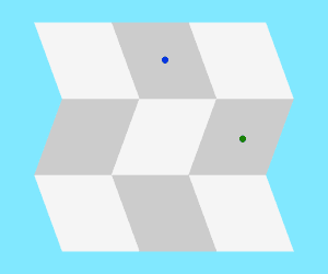
Which of the parallelograms in Image 1 appears darker, the one with the blue dot or the one with the green dot? You probably see the one marked with blue as darker. In fact, however, the two are identical, which becomes obvious in Image 2 (click on the image to toggle between Images 1 and 2). You may even perceive the surface as bending the other way when you click Image 2!
Click the “Folded Card Illusion Explained” link for an explanation of why this illusion occurs and what it reveals about the visual system’s assumptions about surface lightness and brightness.
Folded Card Illusion Explained
Your visual system has a strong inclination to perceive Image 1 as a folded card. As you scan the image from left to right, the changes in brightness from the leftmost to the central to the rightmost parallelograms appear to be caused by moving from a lighter portion of the card to a darker portion and then back to a lighter portion. That is, the visual system makes the assumption that there is a dark vertical stripe printed on the card, and that changes in luminance from left to right in the image are due to changes in the surface reflectance of the card.
On the other hand, if you scan the image from top to bottom, the visual system assumes that the changes in luminance are due to lighting shifts caused by the folds in the card, not to changes in surface reflectance. The middle section of the card probably appears to be in a shadow, which means that the light source is above the card. This is a reasonable assumption to make: the card clearly seems to be folded, and it is unlikely that the folds occur exactly at points where the surface reflectance changes abruptly on its own. Also, most surfaces in the world are lit from above, due to the sun, making the assumption of an overhead light source very natural (more on this in the “Bumps and Dimples Illusion” next). Based on these assumptions, the parallelogram with the blue dot is seen as part of the dark stripe in the light, while the one with the green dot is seen as a lighter surface in the shadow. Even though the areas are equally bright, your visual system cannot discount the perceived difference in lightness, so the two parallelograms do not look identical.
In Image 2, the central parallelogram is changed to white, eliminating the perception of the dark central stripe, and thus the interpretation of the middle section being covered by a shadow. Now, the entire surface seems to be illuminated equally. The visual system has no choice but to assume that all the luminance changes in the image are due to changes in surface reflectance. Therefore, the parallelograms with the blue and green dots are perceived as having equal reflectance and are seen as equally bright, eliminating the illusion in Image 1.
If the card appears to switch orientations when the middle square is turned light, this is a form of an aftereffect, similar to the afterimages discussed in Activity 5.4. In Image 1, your visual system assumed that the surface was oriented towards the right, and the neurons representing that interpretation became fatigued over time. When Image 2 appears, the other possible interpretation of the image—that the surface is facing towards the left—asserts itself more strongly because none of the neurons representing this interpretation are fatigued. The image is equally consistent with the surface facing either right or left, but if you perceived a shadow, then the interpretation that the surface is facing right was initially more probable.
Bumps and Dimples Illusion
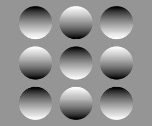
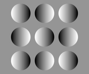
In Image 1, you probably see five convex “bumps” forming an X pattern, with four concave “dimples” in between. But click the image twice and your perception will change. In Image 3 the X is formed by dimples, with bumps in between. In fact, Image 3 is a 180° rotated copy of Image 1 (Image 2 and Image 4 are rotated 90° and 270° from Image 1, respectively).
Why do you see five bumps and four dimples in Image 1 but five dimples and four bumps in Image 3?
Click the “Bumps and Dimples Illusion Explained” link to find out.
Bumps and Dimples Illusion Explained
These images reveal two more assumptions that the visual system makes in order to interpret changes in illumination across an image. First, we know that a portion of a surface that faces toward a light source will be brighter than a portion of the surface facing away from the light. Second, all else being equal, we assume that lighting in a scene comes from above.
In Image 1, the lightest parts of the circles in the X pattern are on top, while the darkest parts are at the bottoms of the circles. If the lighting was coming from above, these circles would have to be bumps, since this configuration would make the lighter portions of the circles face towards the light. Conversely, the other circles would have to be dimples because their bottoms are lighter than their tops.
In Image 3, the scene has been rotated 180° and therefore the situation is reversed. Still assuming the lighting is coming from above, the circles forming the X must be dimples and the other circles must be bumps.
Image 2 and Image 4 are more ambiguous. You may fail to see any of the circles in these images as either bumps or dimples. Note, however, that if you do see them as bumps or dimples, you will also see the lighting as coming from either the left or the right accordingly.
The Checkerboard Shadow Illusion
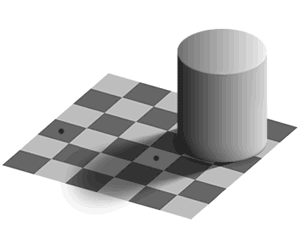
Image 1 shows a cylindrical block sitting on a checkerboard, with a light source above and to the right of the cylinder, causing it to cast a shadow over part of the board. Would you believe that the two checkerboard squares with black dots are exactly the same brightness? Image 2 isolates the two checkers and should prove to you that they really are identical.
Click the “The Checkerboard Shadow Illusion Explained” link to read an explanation of the illusion.
The Checkerboard Shadow Illusion Explained
As with the folded card illusion, this illusion happens because your visual system cannot disregard its interpretation of the light sources and shadows in scenes when making judgments about the brightness of surfaces. The marked square near the center of the image falls in the shadow of the cylinder. Since we assume that shadows make surfaces less bright, we boost our estimate of the reflectance of this square accordingly. We also assume that the checkerboard pattern is regular, so that the lighter squares in the pattern are all the same lightness and the darker squares are all the same darkness. These assumptions lead us to strongly believe that the more central marked square in the shadow is lighter than the marked square on the edge of the board, so we are tricked into thinking that the former is brighter than the latter, too.
As the creator of this image, Edward Adelson at MIT says, “The visual system is not very good at being a physical light meter, but that is not its purpose.” The assumptions used by our visual systems are designed to help us determine the qualities of surfaces in the world, not the light reflecting off the surfaces. It is the surfaces themselves that we want to know about, not the particulars of how they happen to be illuminated.


