Background Reading: How do life table variables affect the survivorship curve?
The key life table variable in a survivorship curve is the age-specific survival or . This variable represents the proportion of individuals of age that survive to age . At birth, the value is 1.0. It declines to 0 when the organism reaches its maximum lifespan. Survivorship curves are graphs of the log number surviving per 1000 born as a function of age. For the life table in Table 8.2 we generate the log number surviving per 1000 born as follows:
Table 8.2 A life table for Dall sheep at Denali National Park, Alaska (data from Muries, 1944)
| AGE IN YEARS (X) | NUMBER ALIVE AT START OF AGE () | PROPORTION SURVIVING AS FRACTION OF NEWBORN () | NUMBER DYING IN AGE INTERVAL () |
|---|---|---|---|
| 0 | 608 | 1.000 | 121 |
| 1 | 487 | 0.801 | 7 |
| 2 | 480 | 0.789 | 8 |
| 3 | 472 | 0.776 | 7 |
| 4 | 465 | 0.764 | 18 |
| 5 | 447 | 0.735 | 18 |
| 6 | 419 | 0.689 | 29 |
| 7 | 390 | 0.641 | 42 |
| 8 | 348 | 0.572 | 80 |
| 9 | 268 | 0.441 | 114 |
| 10 | 154 | 0.253 | 95 |
| 11 | 59 | 0.097 | 55 |
| 12 | 4 | 0.0065 | 2 |
| 13 | 2 | 0.003 | 2 |
| 14 | 0 | 0.000 | 0 |
Thus, for example, at age 1 the log number surviving per 1000 born is:
Survivorship curves vary widely among species. However, three broad patterns emerge, as shown in Figure 8.12. Type I survivorship curves are characterized by low survival in young ages, then high survival until old age, when mortality increases rapidly. In Type II survivorship curves, survivorship is constant across ages, leading to a linear relationship between lx and age. Finally, in a Type III survivorship curve, early mortality is very high but decreases in older ages.
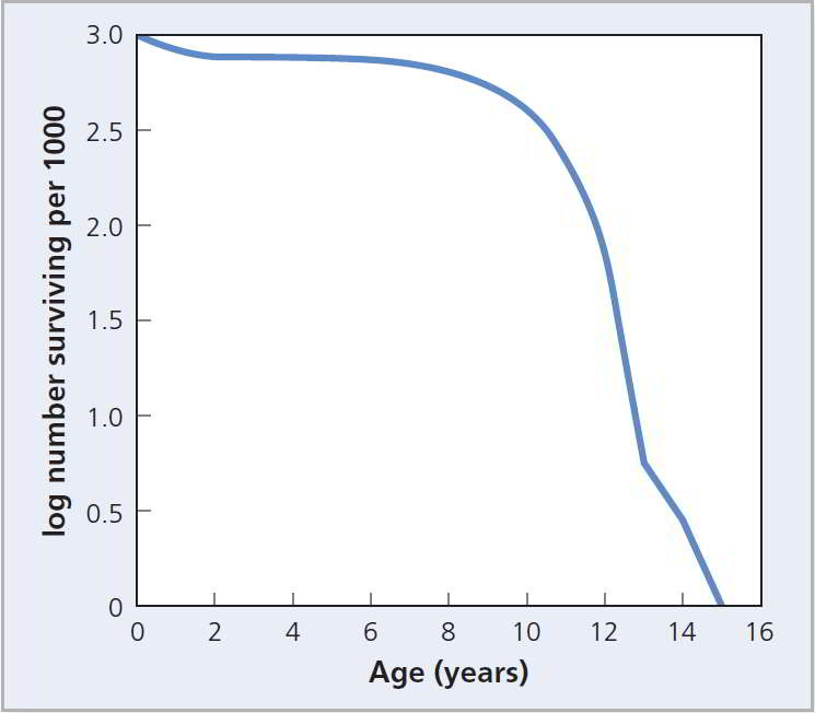
Figure 8.11 Survivorship curve. A survivorship curve for the Dall sheep data presented in Table 8.2 plots the log number surviving versus age (data from Murie, 1947).
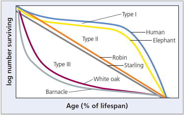
Figure 8.12 Types of survivorship curves. The three types of survivorship curves and examples of species with each type.